Challenge 7: Make it Look Pretty
12/4/2025
After more struggles than I was prepared for, and a 101 degree fever, I have made it this far.
For this devlog, we will be looking at the Audio, VFX, UI, Materials, and Lighting!
Goals
My goals, first and foremost, were to lean into the comfy, but slightly unsettling energy. I want my players to feel tense enough that there is a air of danger, but overall cozy, and warm. My low poly assets, and fantasy setting needed to be enhanced every step of the way! I wanted fun and eery, yet simple, music, soft lighting, simple UI, and few VFX.
Lighting
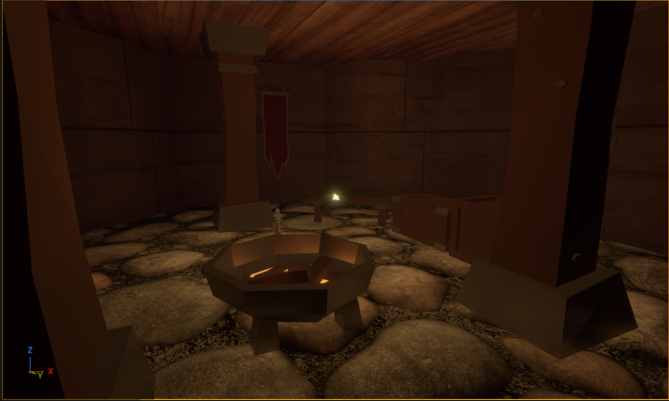
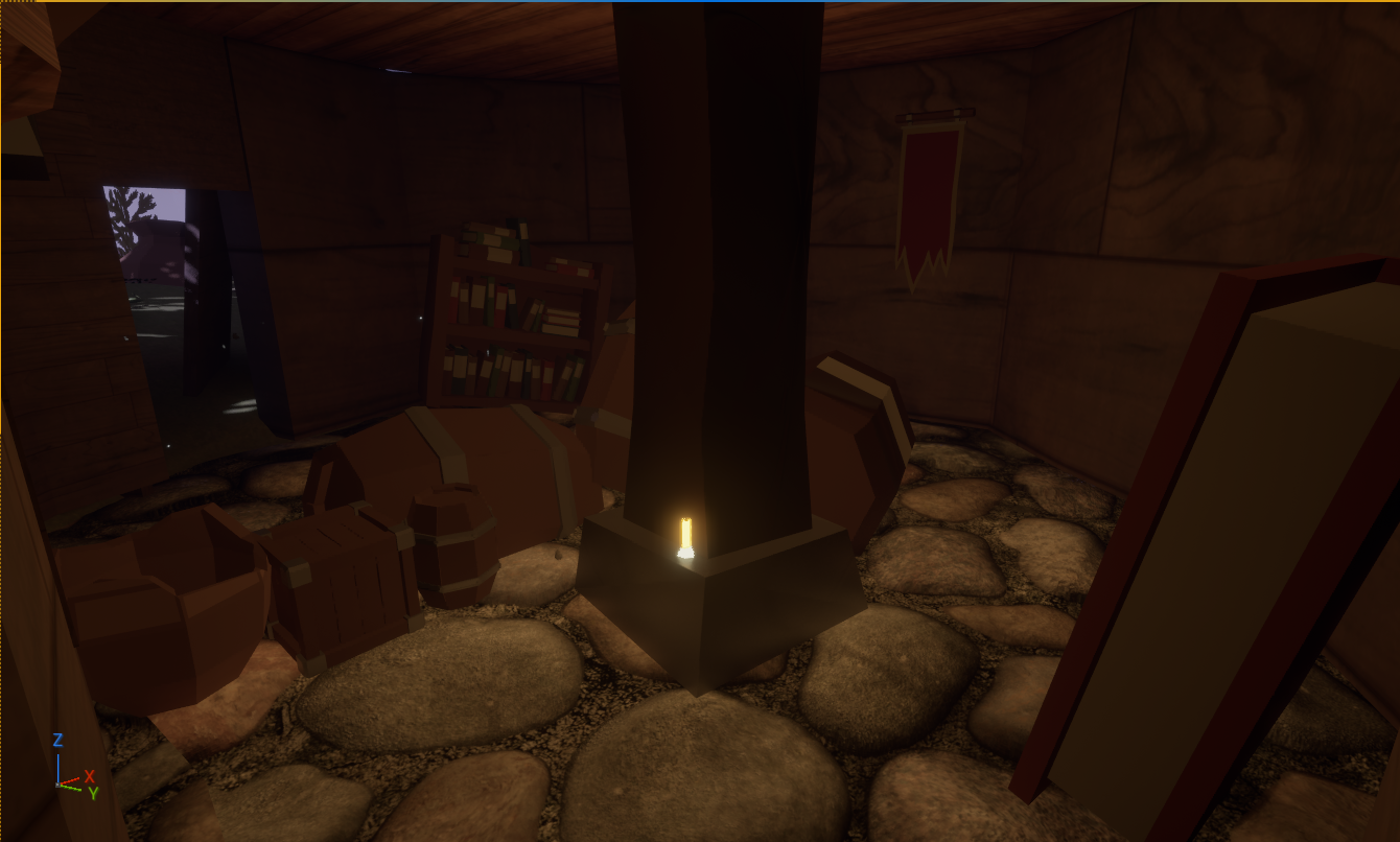
First was lighting, and post processing. I really wanted to settle with a night time feel, and finding a balance between dark, but visible was mostly just tweaking the exposure, temperature, light color, scattering, and using some point lights. I choose to use two warm toned point lights in the interior to contrast with the cold outside. I hoped this would create a shift in tone to feel more dangerous as the level goes on. The warm tone also is an obvious indicator of indoors, and cool tone for moon light.
The post processing volume aims to increase the exposure, since the harsh lighting of enclosed rooms and moon light make the shadows INTENSE. I imagine most people would want to SEE their character, even when embracing the shadows to hide behind bookshelves, or in small nooks.
I also utilized the point lights to create am ambient lighting instead of "point light" or diegetic light. It helped make the room look a bit moody, but also brighten up the shadows some, as I turned off shadow cast for the interior lights.
There are also candles that help point the player in a general direction through the rooms, without fully guiding them. One is placed near the first enemy and exit to guide the players attention towards the first doorway, then the next is on the pillar, to indicate that is the general direction they should go next. Fireflies are (supposed) to float around out in the moonlight, and pull the player to the final area.
VFX
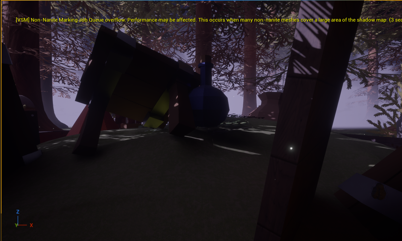
Speaking of fireflies, they are one of the VFX I put together following a tutorial. More information can be found in my last devlog, but they create a comfy and pretty atmosphere. However, near the end of clean up, my dear fireflies disappeared, and were no longer visible. I spent nearly an hour trying to fix them and to no avail. They seem to work in other levels, just not the game-play one. I will include a video of them at their brightest.
I also used Fog around the area to create the illusion of a deep forest in which the player is in, and to creepily contrast with the pretty trees and flowers surrounding the campsite.
Audio
UI Sounds And Music
Now I am no composer, but I think for putting together some handmade pieces I did alright. I wrote the theme for the title screen, created the soundbytes for the UI buttons, The checkpoint jingle, and the Level Complete jingle. I used Chiptune and Synth to make a bubbly, classic, and clean sound, as to me this felt fitting with the low-poly art style I leaned into. The title screen is loopable, but can be paused, the checkpoint is short and sweet, and the level complete is fast paced, and fun!
I used a 'Royalty Free' 8 bit composition from pixalbay, as I ran out of time to compose a minute long looping track. It sounded quick paced to match the "your in danger" vibes, but not intense to feel like a full on boss fight.
And I got totally one upped by my actual composer friend when I showed him my "You Died" tune. ("LOL, That's Horrible" - Him upon hearing it) He made me a much better and more playful sounding one. Full credit to NROC for creating 'RIP' for me and letting me use it!
Game SFX
For the game SFX I didn't want it to sound too realistic, but still be clear on what it was. I found a handful of royalty free sounds and chopped them up. The Armor Footsteps is 6 individual clanks, randomized to sound more natural, and pitched down to mellow the sound. My playtester gave me great feedback, having me double the radius of which you can hear the footsteps, since you could only get close enough to hear them by getting chased. "Your world is much more open than other Stealth games, you should consider that when it comes to all the notifying audio. I would double all of it."
The Punch is a pitched down punch audio I found, it sounded metallic. My playtester gave me notes saying it was "Too high pitched and annoying". A tune down made it feel a lot better.
The fire crackling is my favorite. I love hearing it crackle slightly, in the opening room as you start, and at the end. It is cozy, and feels very fantasy/tavern-y.
The biggest issue for my "Low Poly" audio was leaves. All the leaves audios I found were just TOO crunchy and felt off. So I tried Crumbling Paper. It was so much better and fit the game better to me. It had less clutter to it too. I think that made it sound "clean".
Materials
Now, I tried to keep materials mostly plain, to match the low poly of the characters. The objects around are all flat colors. However, I needed contrast. So, the Floor and Ground are all more detailed to make the objects and character stand out!
The floors are pebbles, since I wanted a slightly abandoned area, that had been cleaned up and made into a living space for my people.
Not to mention, they are tiny, so everything else? It's big. Big books, tables, jars. Player should feel small.
Here is where everything I think went to hell and broke everything.
I found a really neat "Wood material" assets that looked like worn planks. Perfect for the walls and fence!
It overloaded my game, broke assets I put it on, and honestly the only thing that survived was the gate for the win. I left that because I had to have SOMETHING and everything else was not looking right. The walls turned into some worn wood instead, and if you don't look too closely, it looks decent. I would honestly prefer some vertical textured wood, but what I have was the best without breaking my game.
UI
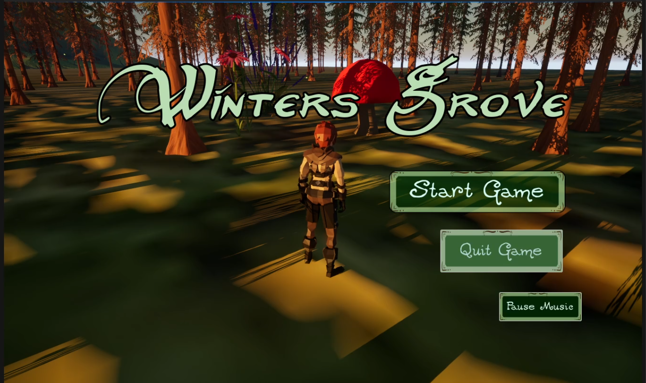
This was my favorite part. I had SUCH a blast putting it together. I went for a green, brown, and off white color scheme to compliment the earthy vibes of my game.
Then, I custom made assets for my buttons in Canva, that when hovered switch colors. They also have randomized Hover sounds, to keep it not sounding "samey samey" and specialized click sounds for "Resume/Start game" "Quit" and "Main Menu". Resume and start have the most cheerful note, and quit has the lowest note. Main Menu is in the middle, and "Pause Music" is quiet. I think thats fairly on the nose, but each bit should inform the player!
The Death screen has a red vignette and a hand drawn squiggle. Wow! Red = Death! I know, I am an innovator :)
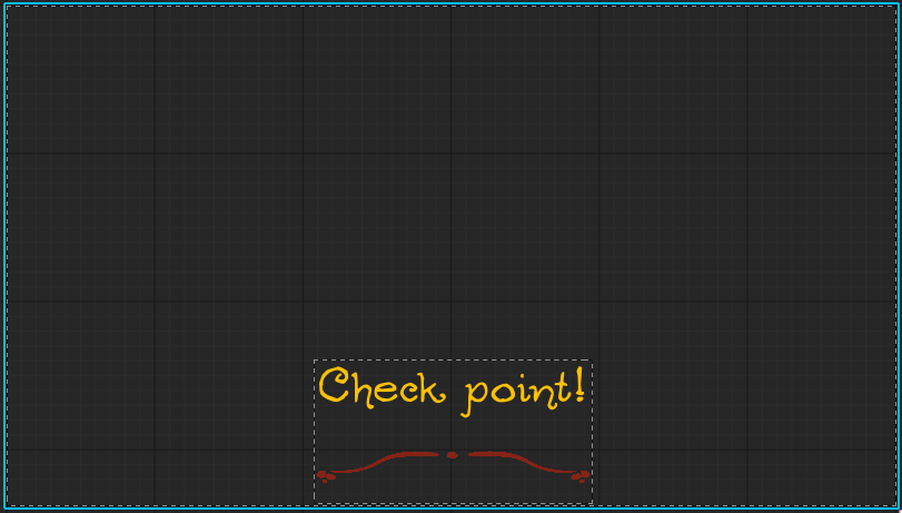
The Checkpoint is the most simple, to be least intrusive mid game "You should add a check point audio and pop up. Make sure its non-obtrusive though, it would be annoying if it got in my way or was too noisy." said my wonderful play tester. It's orange for a more positive feel, and to be different from the level complete widget.
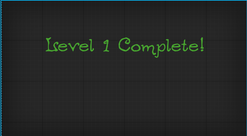
And win/ level complete widget, It has a slight Vignette, grey. If moving on to the next level, the screen would not be fully covered to allow the player to walk to the next level without it in your face. However, there is no 'Next level' so it shows up, and fades the player back to the start instead. The text of course is green! But, since it would happen during game play I aimed to make it simple and non- obtrusive like the checkpoint.
For the Pause Menu, it states at the top "Game Paused" in the Old Forest font for clarity and differing it from he buttons, and has my custom buttons used below. I made a backdrop to make it stand out, and a slight blur affect for the game behind it. Simple, but cute.
The start menu really displays all my font choices. My two I used are Neverwinter and Ogdread Weary. Neverwinter has a lot of flare, so it's used for my game title. The Ogdread Weary is used everywhere else as my secondary font in the hierarchy. Its playful and a bit weird, but legible.
Playtesting
Play testing helped me nitpick a lot of things I easily overlooked. My play tester found areas he could get through and off the map, things that loosed weird that I missed, and floating objects. He also helped me pick up design choices that made no sense, Like how there was no pillar in the second room, and the door frames felt like gaps not frames.
He overall liked my lighting and tone, but pointed out some areas that were too dark or looked strange.
He pointed out some issues with room transitions, which I cleaned up, and audio balancing for best 'hearing' experience.
And he gave me pointers for some of my UI Elements. He recommended that they shouldn't say "Top text Bottom Text" which was fair enough I guess.
Overview
I learned a LOT through this. The trial and error, while tough, frustrating, and also completely crashing my laptop and corrupting some of my video files, taught me a ton. And while this game is honestly a hodpodged mess, I can use so much of what I did going forward to improve.
Something EXISTS and it's got a little bit of everything, and help from some great people. So while It is far from perfect, and not really riveting gameplay wise, It was an experience I enjoyed.
Leave a comment
Log in with itch.io to leave a comment.